WATCH IT
ECOMMERCE • DESIGN • UI
A traditional brick and mortar that has been a leading destination for watch enthusiasts since 1999. The goal of this concept is to improve the online customer experience with strong design and photography.
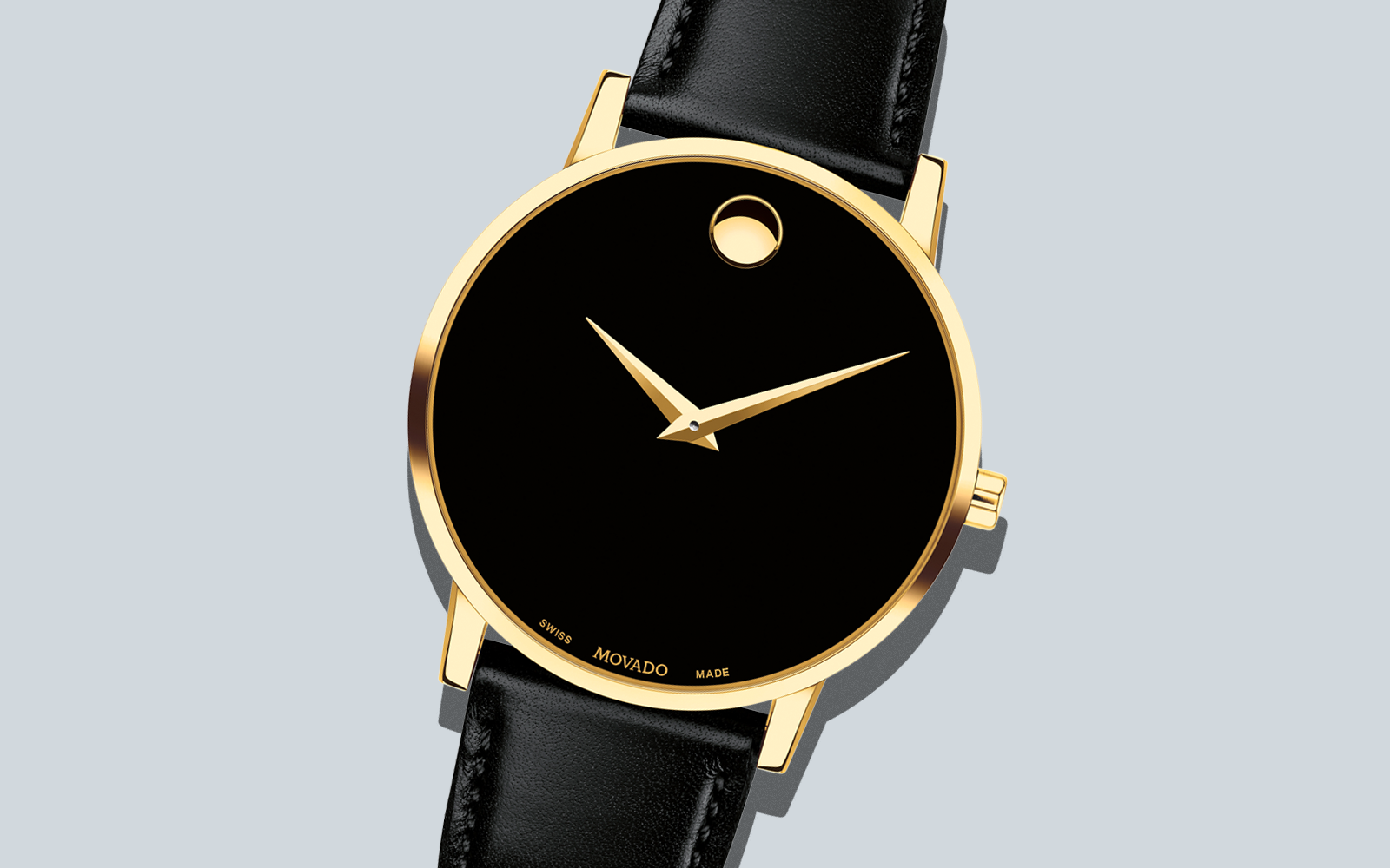
( Fig. 1 ) Modavo Hero Banner
Problem & Solution
While their ecommerce website has a vast offering of watches for men, women and kids it is challenging to navigate. The website lacks a visually appealing homepage that showcases the various brands and styles available.
The solution was to design bold and striking homepage graphics, improve the navigation and create a consistent look for the product pages.
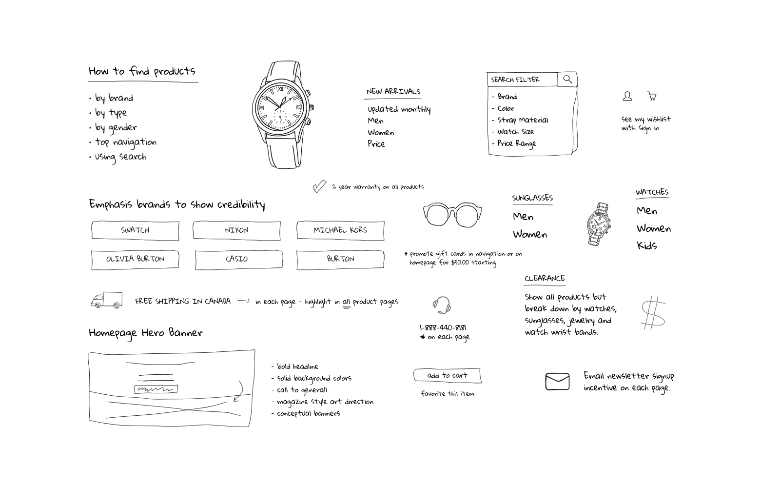
( Fig. 2 ) Visual brainstorming
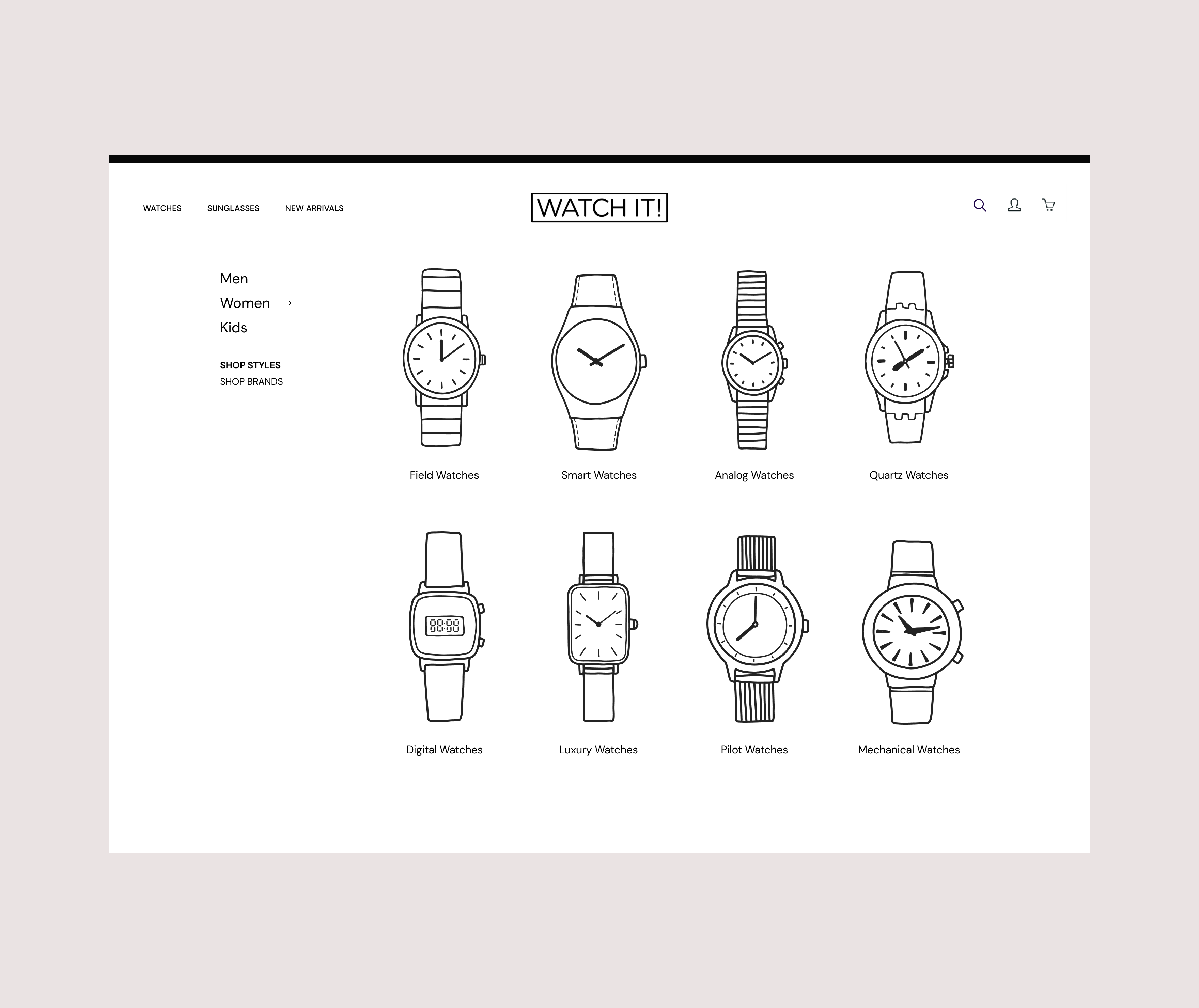
Site Navigation
A lot of thought and experimentation went into determining the navigation. There were questions concerning how to break down the site navigation based on brands, style range, gender and product categories.
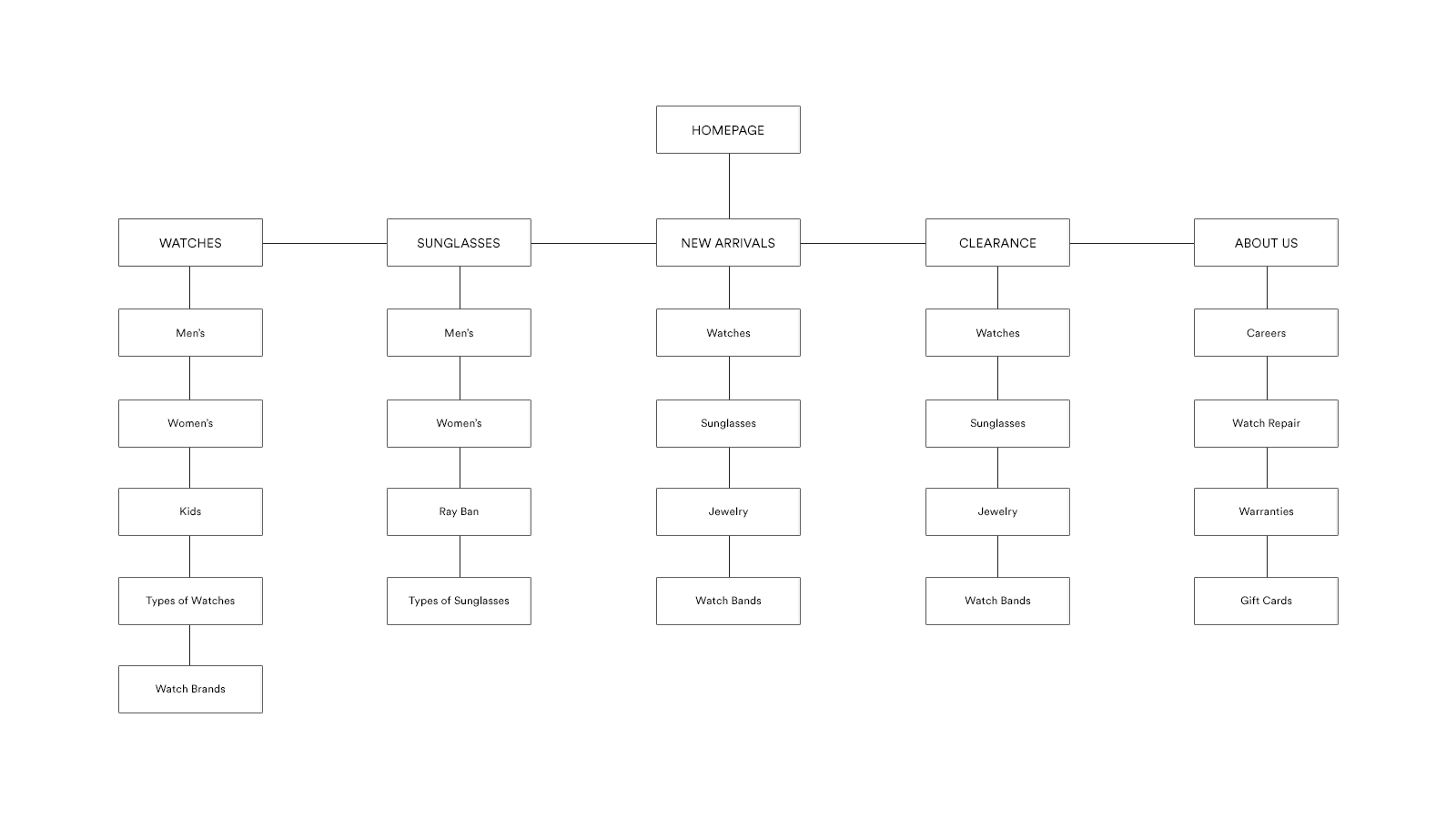
( Fig. 3 ) Site Map
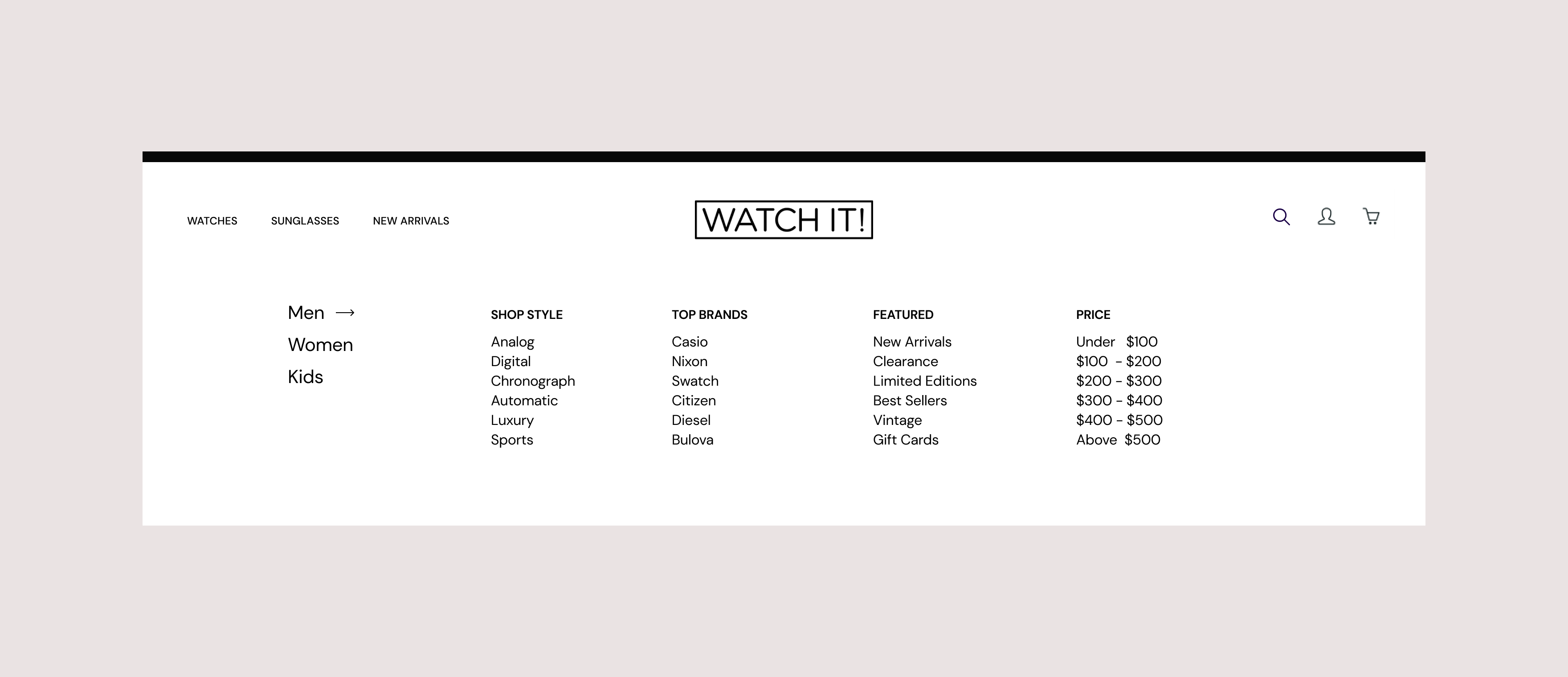
( Fig. 4 ) Navigation Exploration - Filter
( Fig. 5 ) Navigation Explorations - Watch Type
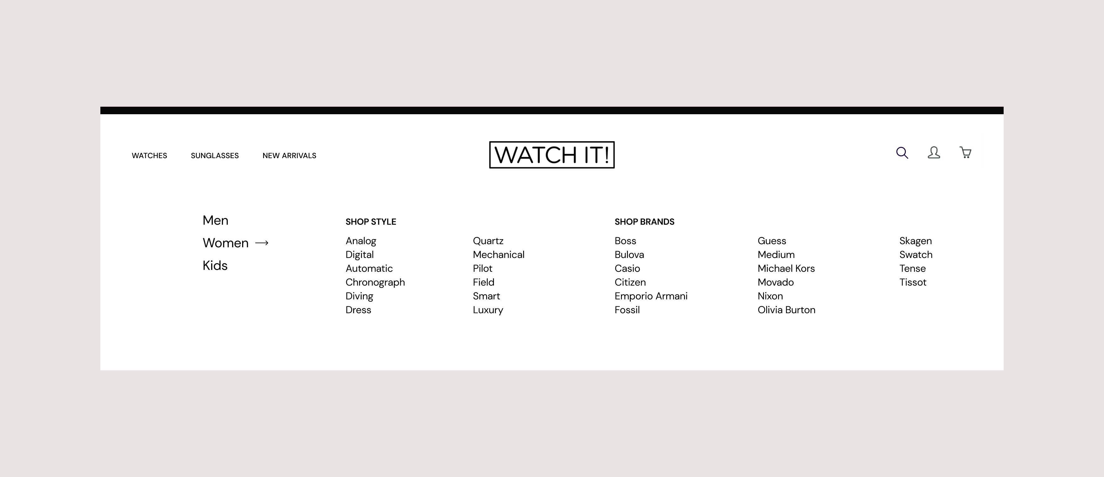
( Fig. 6 ) Navigation Explorations - Brand
Mobile Experience
There is no question that more than half of site visits are coming through mobile. The goal was to create a consistent and seamless customer experience on a phone as well as on desktop.
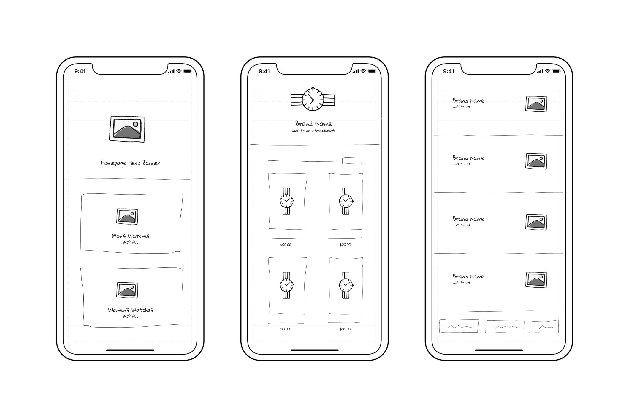
( Fig. 7 ) Mobile Wireframes
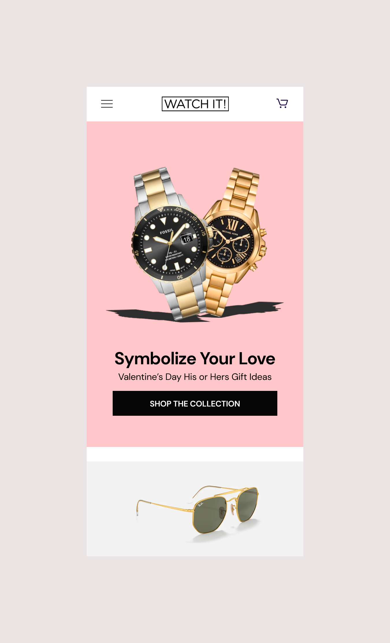
( Fig. 8 ) Mobile Homepage
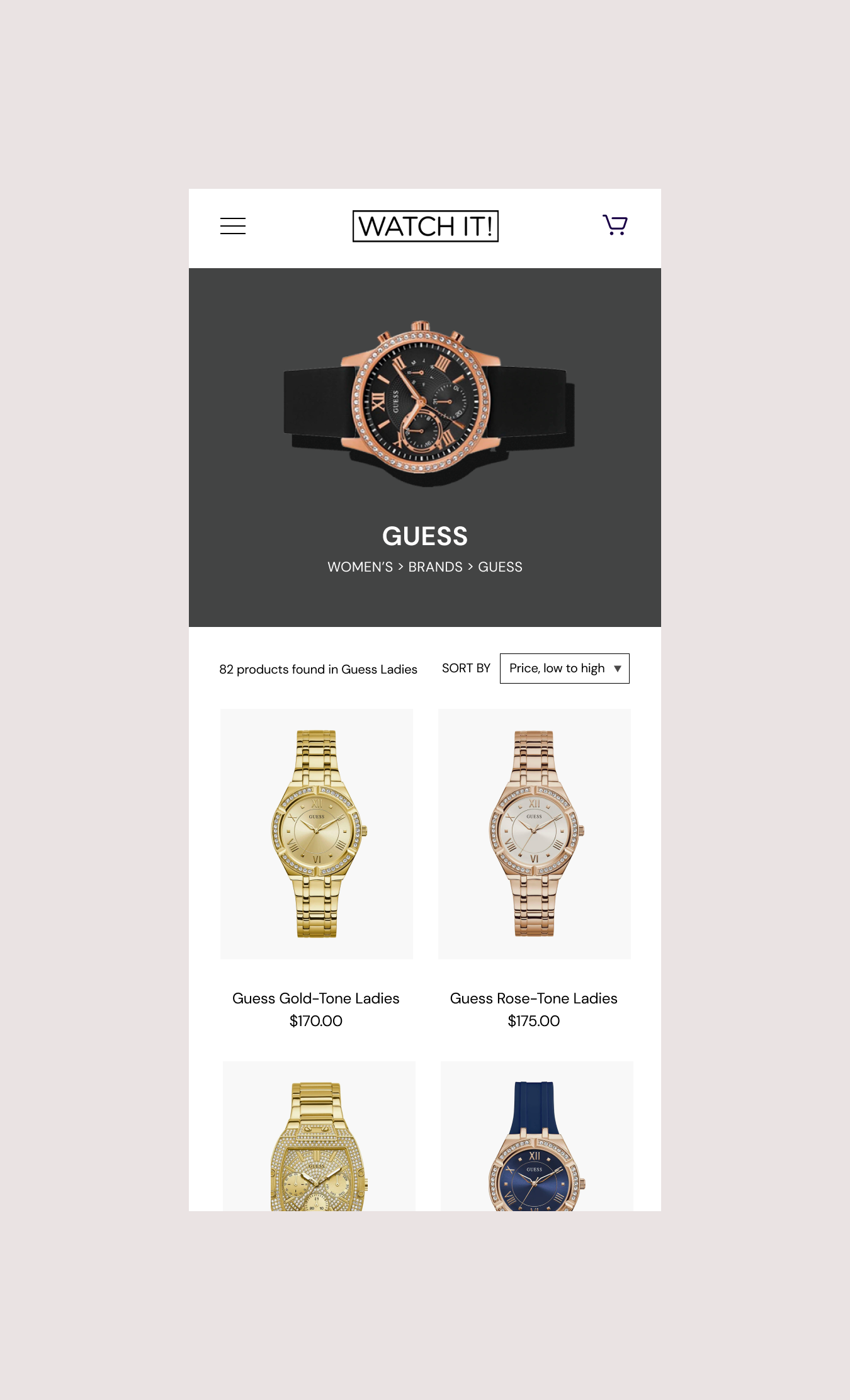
( Fig. 9 ) Mobile Watch Brand
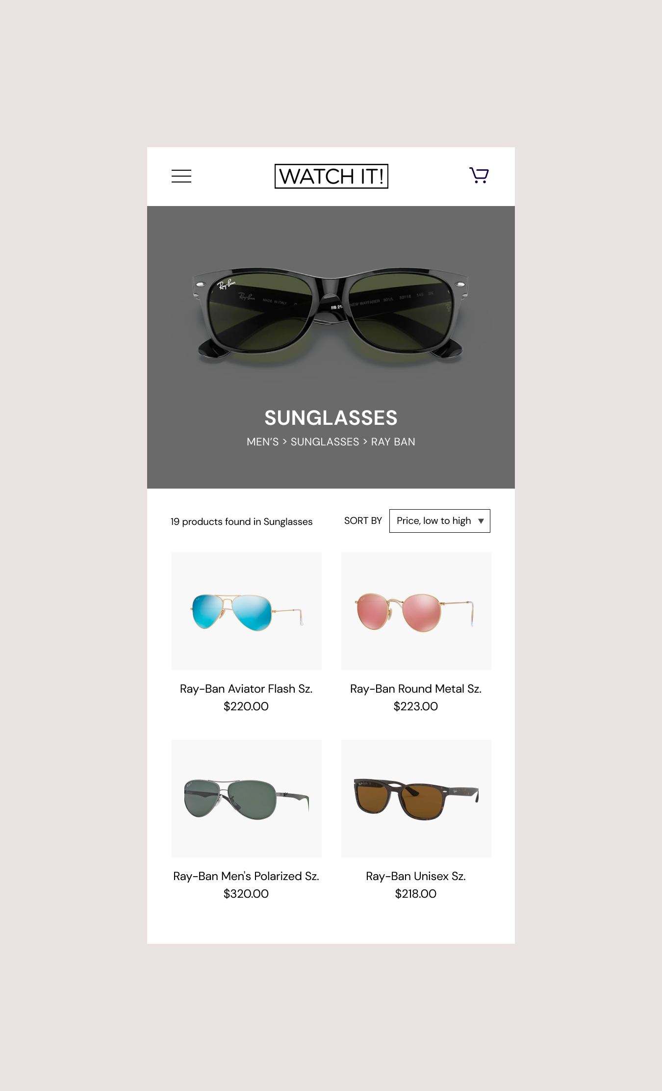
( Fig. 10 ) Mobile Sunglasses
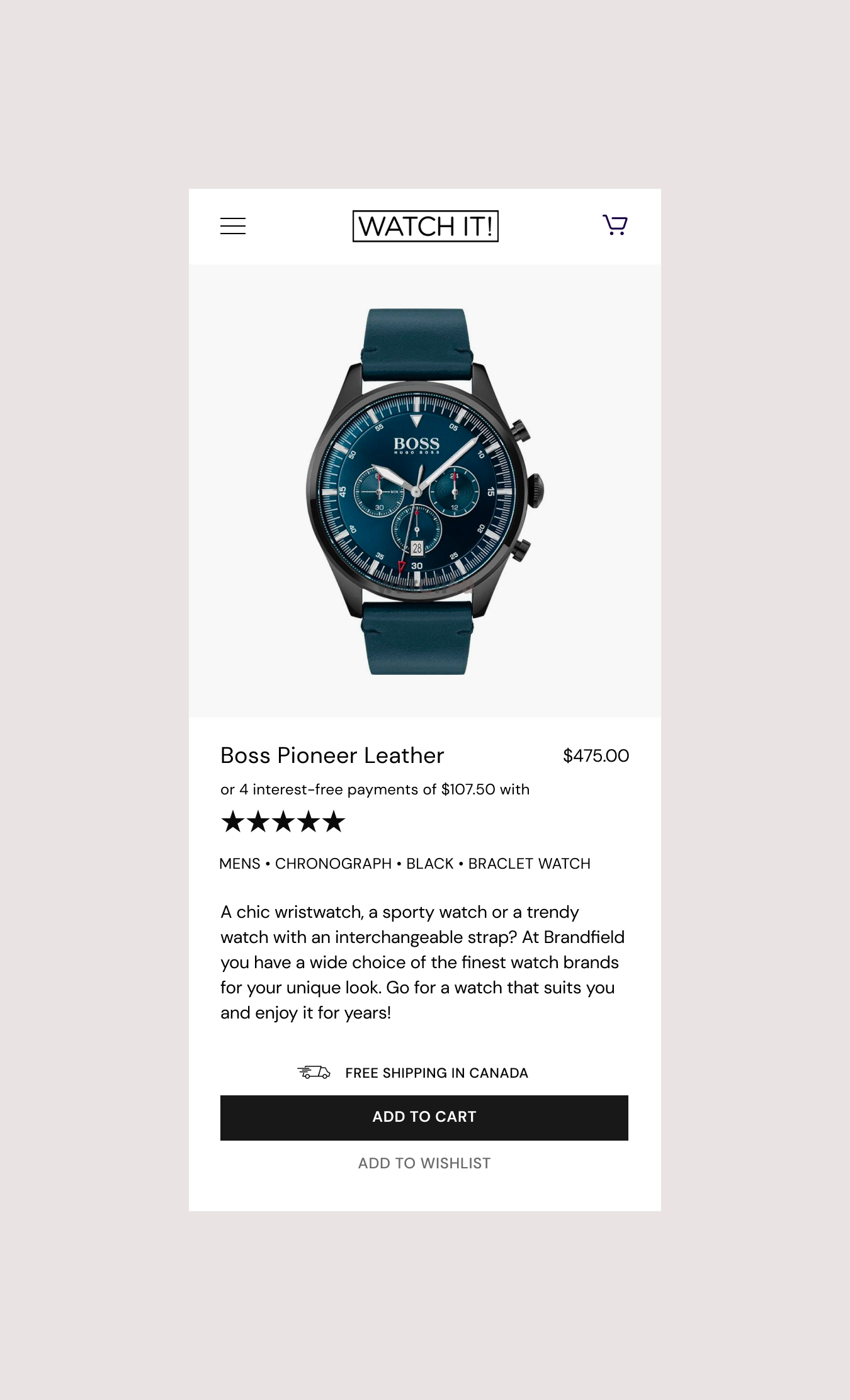
( Fig. 11 ) Mobile Product
Homepage Design
The main areas of focus for improving the desktop experience are the homepage hero banner, promoting recognizable brands and emphasizing an ongoing email sign-up offer.
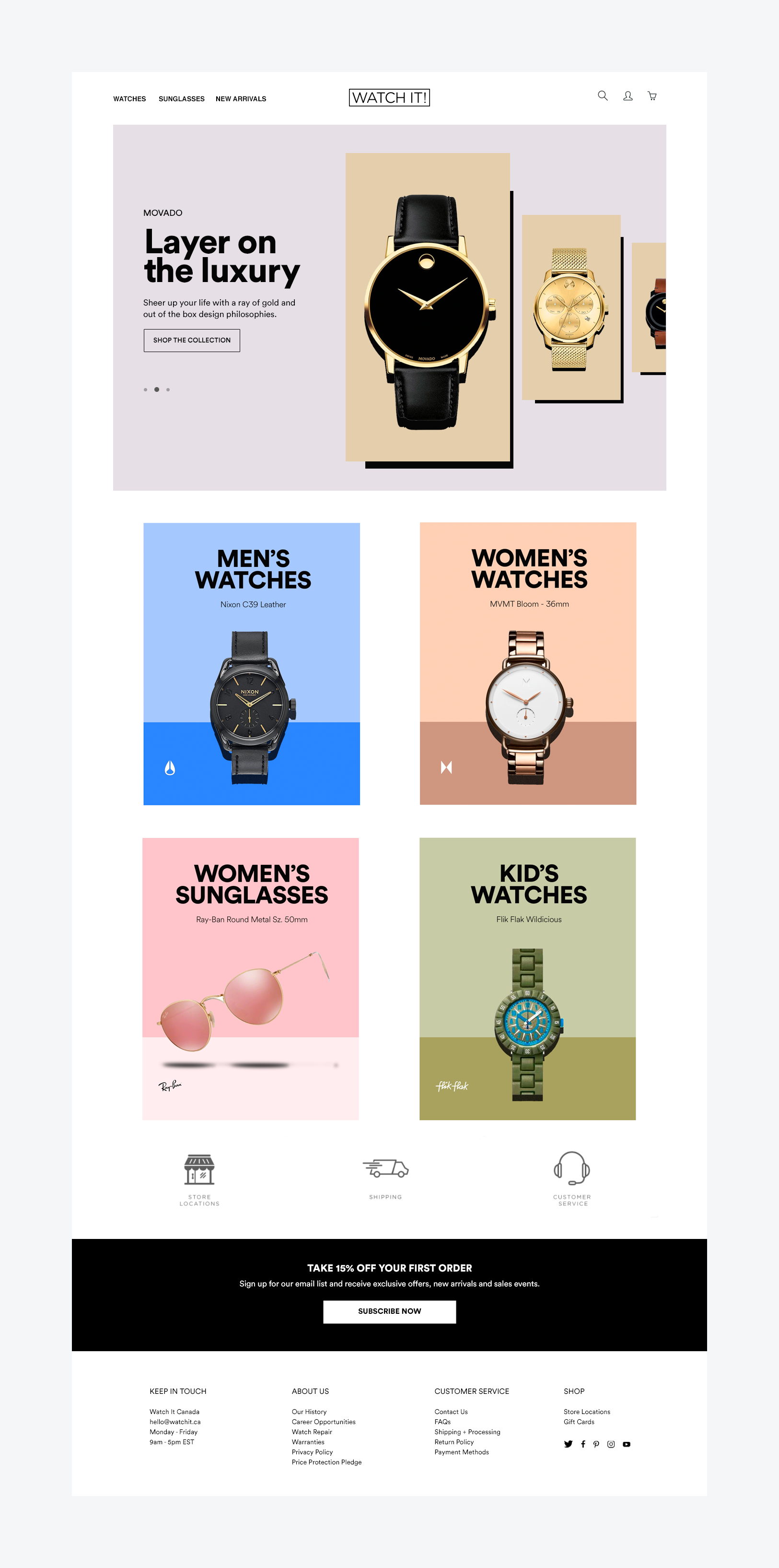
( Fig. 12 ) Destop Homepage
Product Pages
One thing that has been lacking is consistency with regards to the individual brand pages. The goal was to create a uniformed look that can be used for all the available brands.
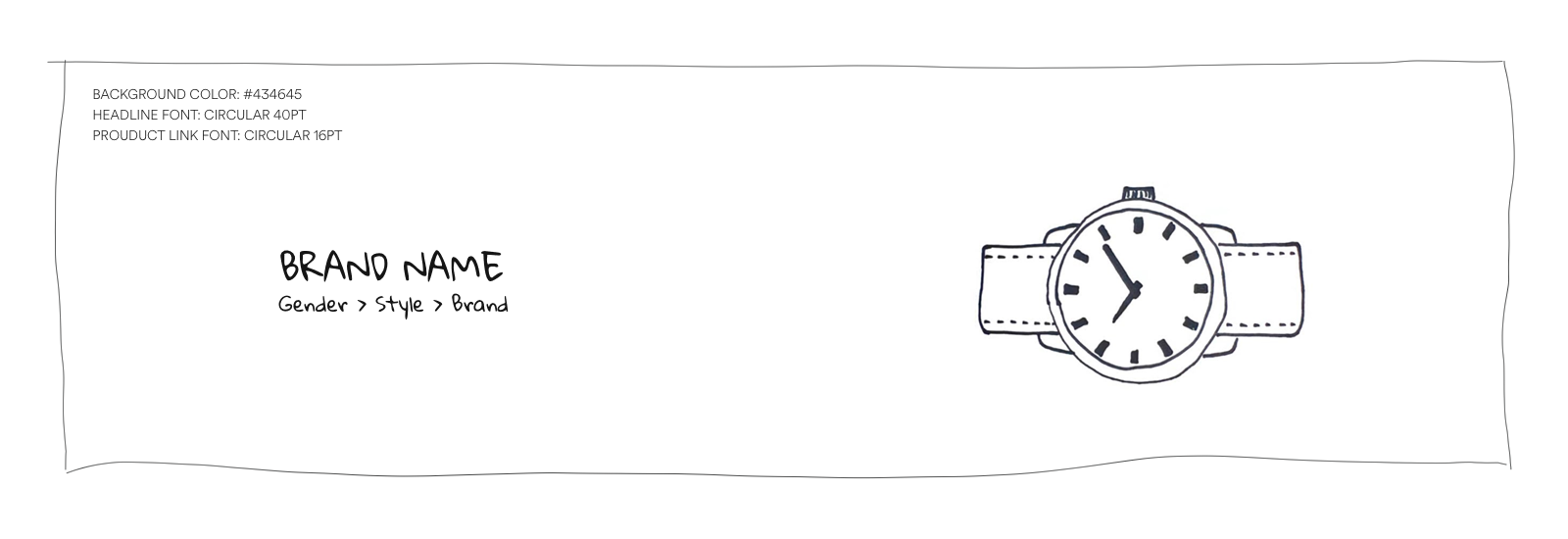
( Fig. 13 ) Brand Header Sketch
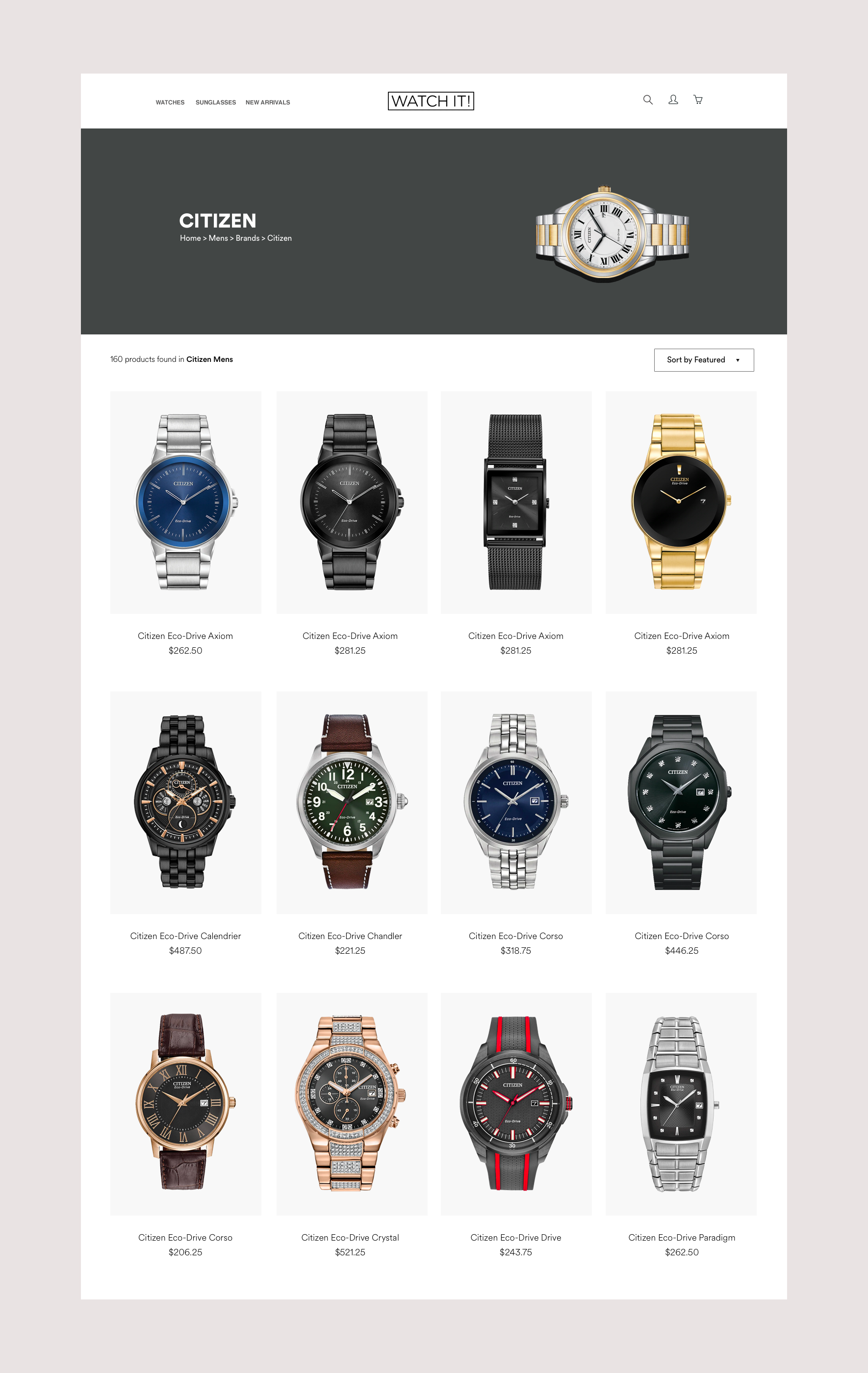
( Fig. 14) Citizen Watch Product Page
Product Details Page
A major focus for the product pages was strong photography. Want the product through imagery to shine. The hierarchy draws attention to the 2 year warranty, free shipping and the monthly payment option. Also wanted to include the customer service number on each product page so customers don’t have to look for it if they have any immediate questions.
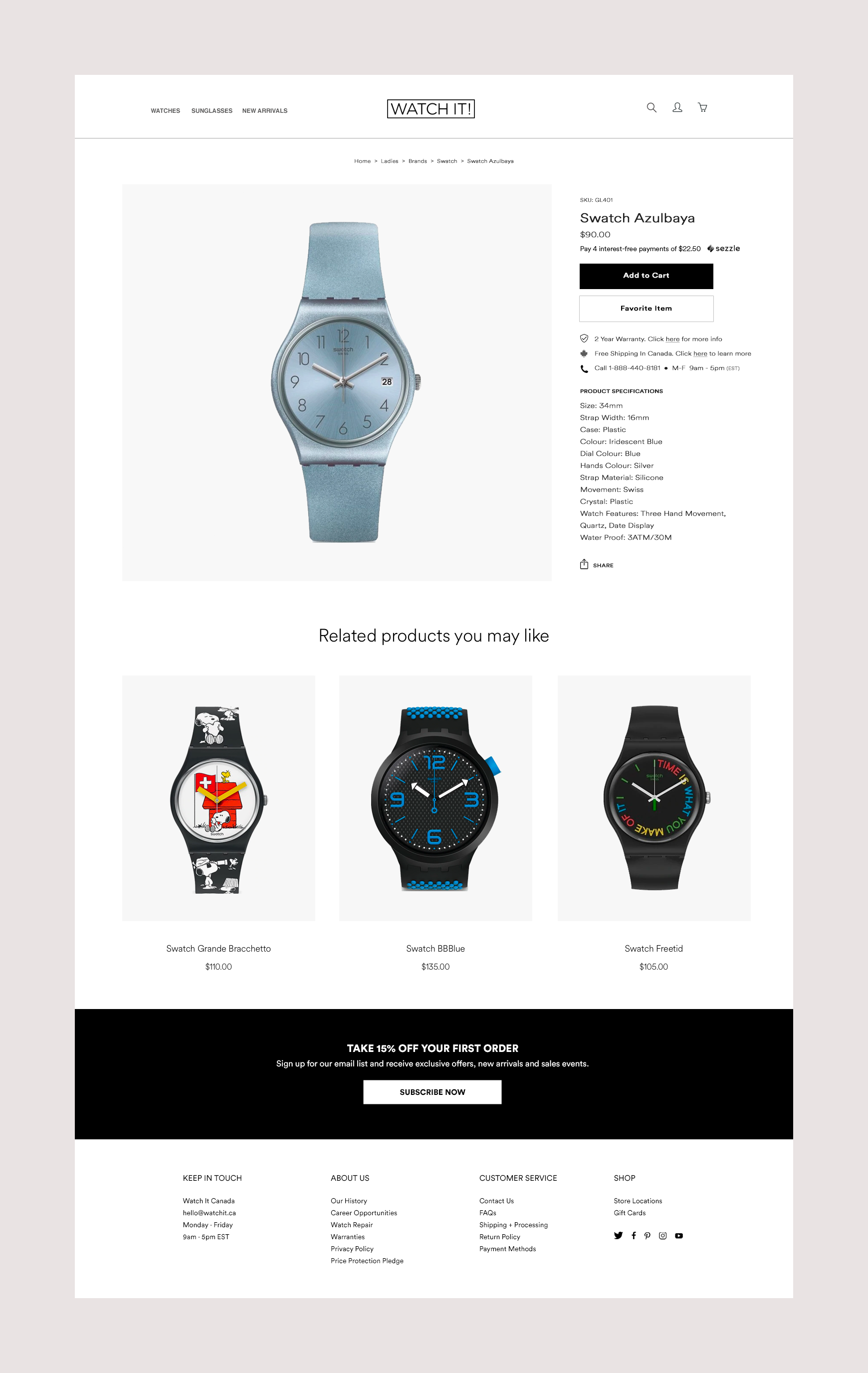
( Fig. 15) Swatch Desktop Product Page
Conclusion
By reimagining the digital experience we can improve the buying process, allow room for brand design and showcase the range of product offerings. Strong design and photography creates a good first impression for first time visitors. Creating a design system allows for a consistent experience on each page, regardless of brand or section. Every decision was tailored to craft a seamless online buying experience.
THANK YOU FOR SCROLLING