JYSK Bed Bath Home
ECOMMERCE • DESIGN • UI
JYSK is a furniture retailer with over 55 locations across Canada. Working within a talented ecommerce team I created digital graphics, email campaigns and social media creative. Also collaborated with buyers to create a monthly digital content calendar.
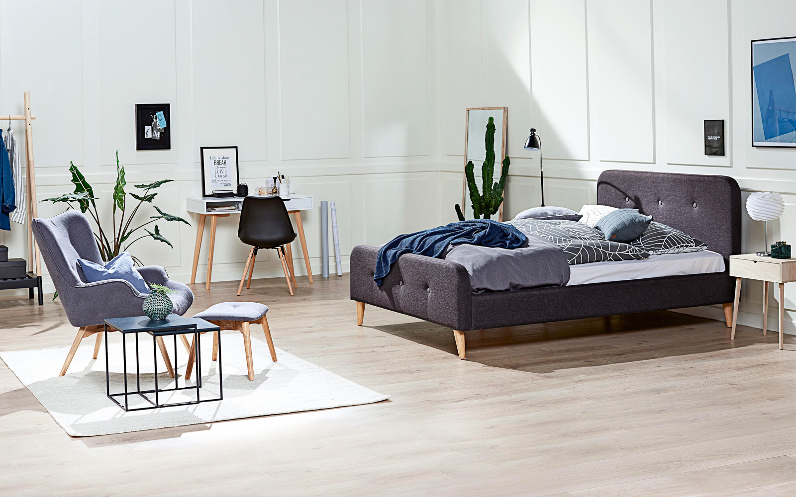
( Fig. 1 ) Lifestyle image
Web Graphics
Every Thursday the homepage graphics needed to be updated to coincide with the new flyer. The goal of the banners is to make customers aware of current promotions and offerings. Focus and time was given to designing mobile friendly banners as more traffic was coming from that channel.
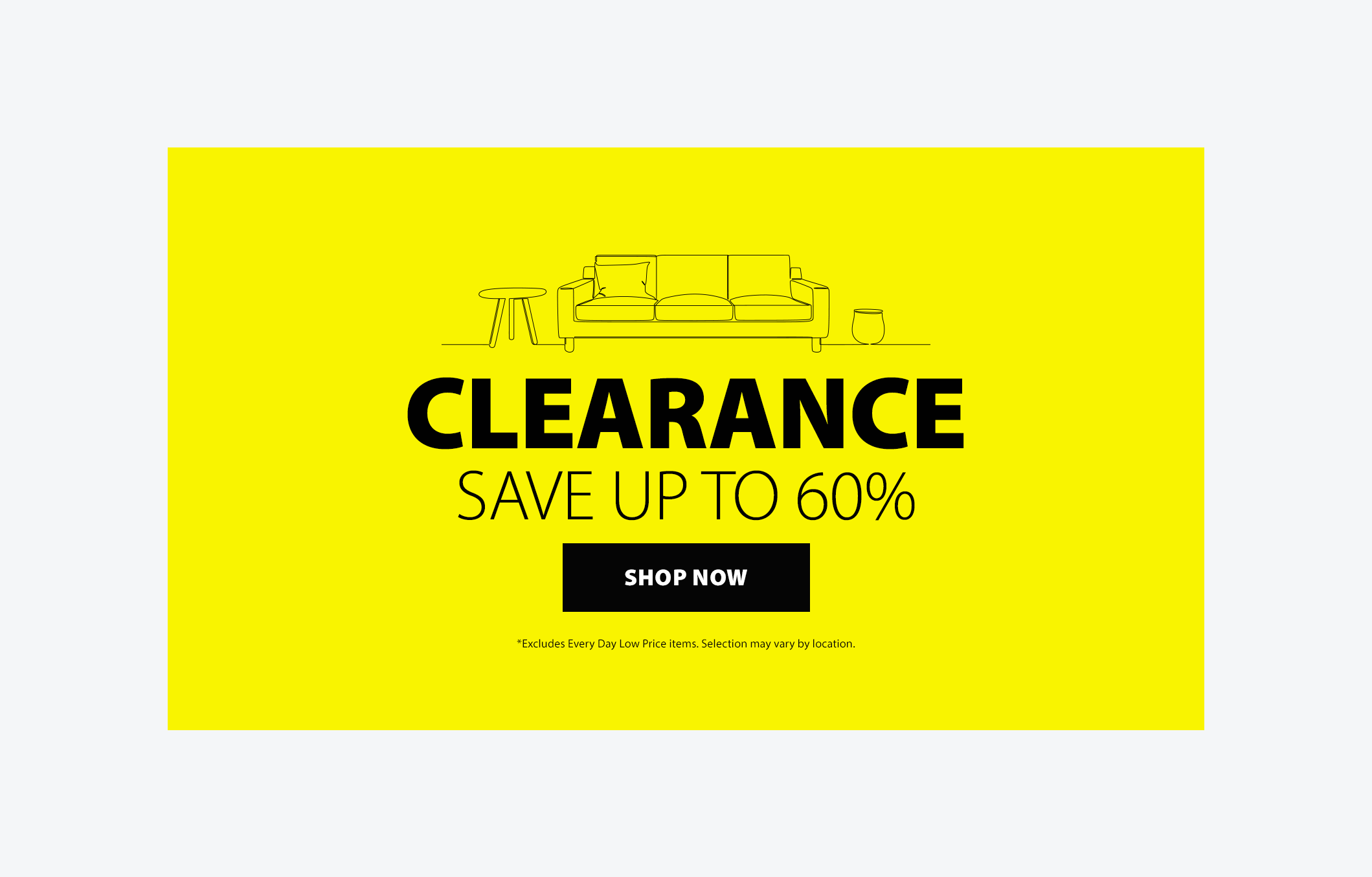
( Fig. 2 ) Homepage hero sliders
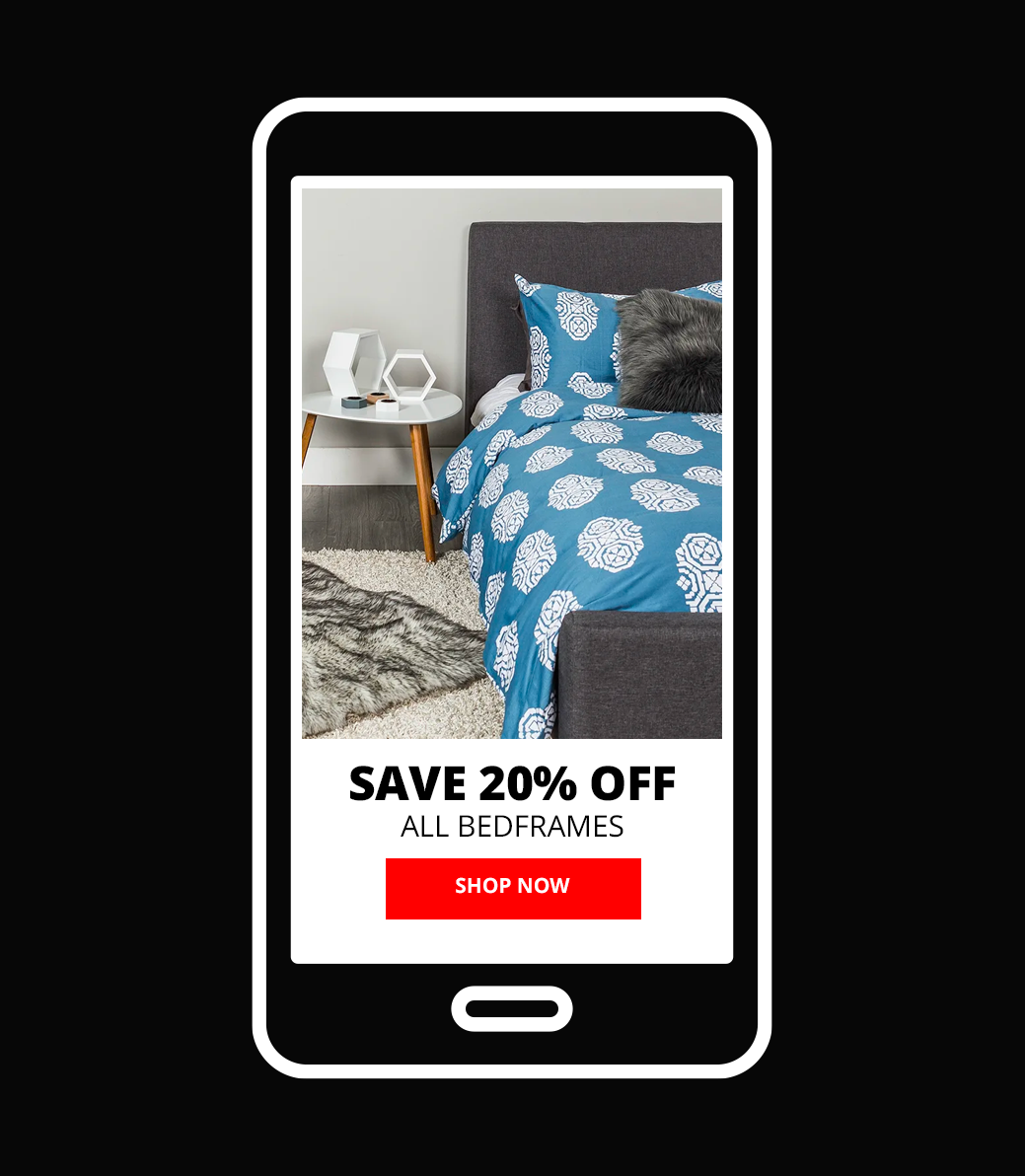
( Fig. 3 ) Focus on mobile banners
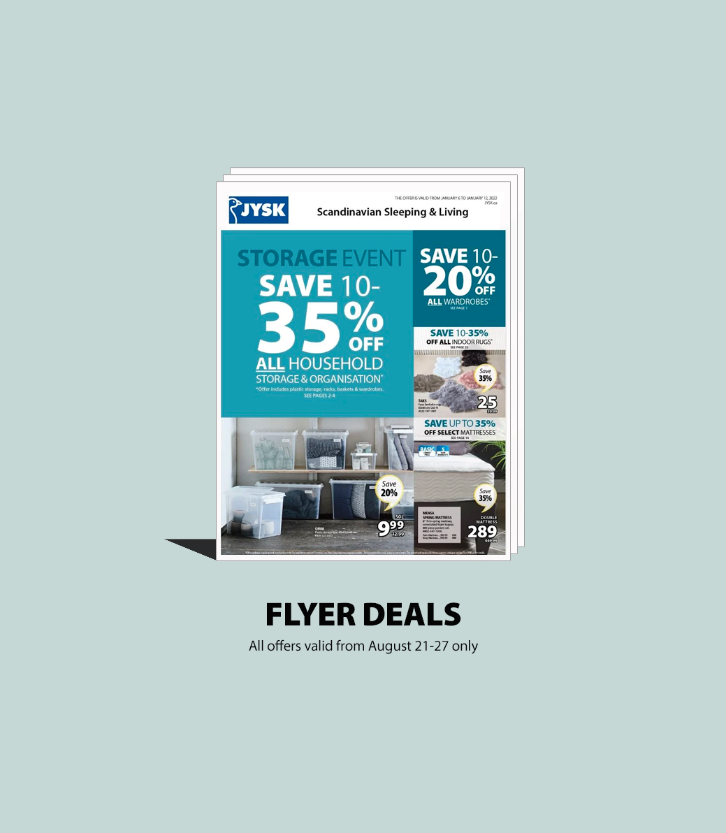
( Fig. 4 ) Weekly Flyer
Improving Interface Design
While keeping with brand guidelines the goal was always to create eye catching visual designs that produced engagement and sales as well as a pleasant user experience.
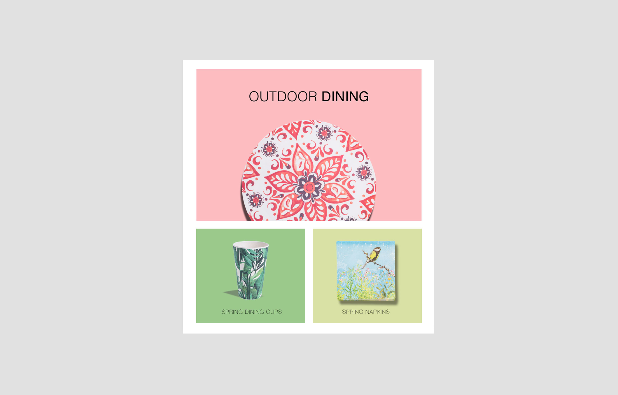
( Fig. 5 ) Digital Art Direction
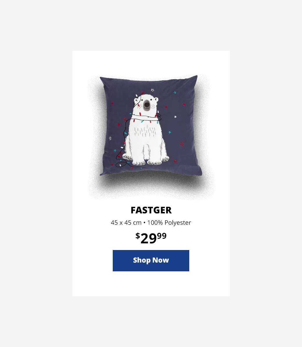
( Fig. 6 ) Product Card
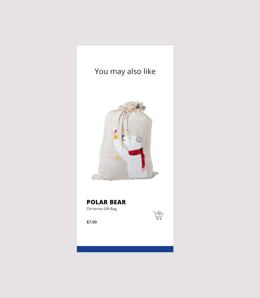
( Fig. 7 ) Promoting related products
Adding Motion
Motion design was used to showcase product features, create a sense of urgency, highlight product offerings and add excitement to graphics.
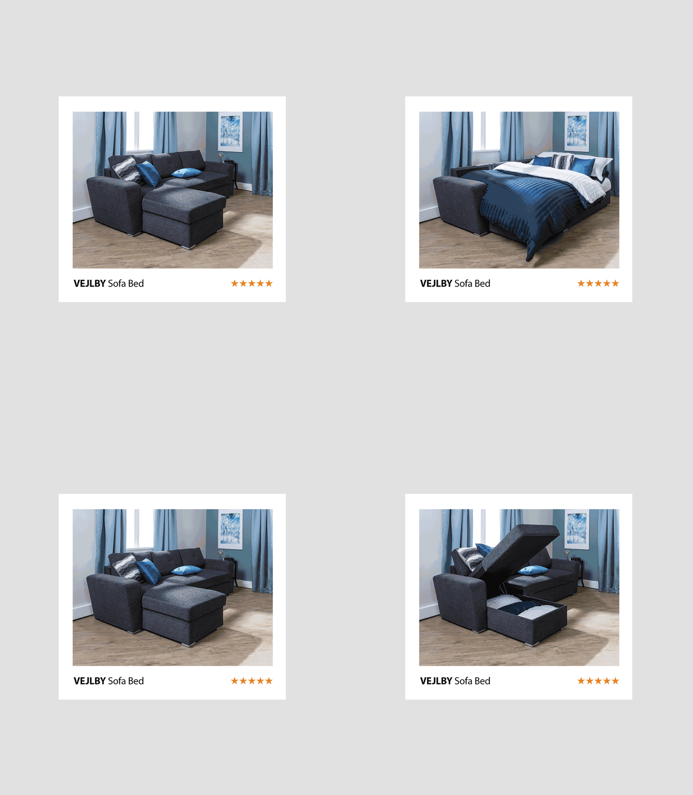
( Fig. 8 ) Showcasing Product Features
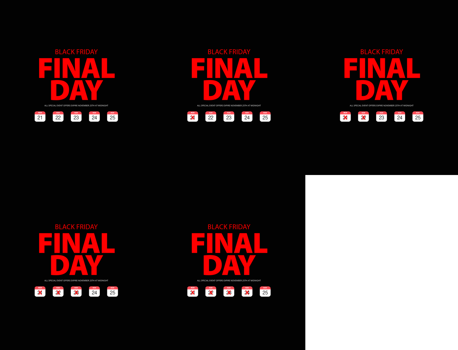
( Fig. 9 ) Creating Urgency
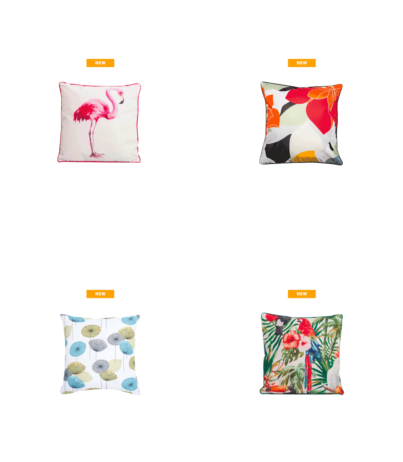
( Fig. 8 ) Highlighting Product Offerings

( Fig. 9 ) Creating Excitment
Social Media
Instagram, Pinterest, and Facebook became main traffic drivers to the website. Strong creative design, product photography and animation was used to get attention and create engagement.
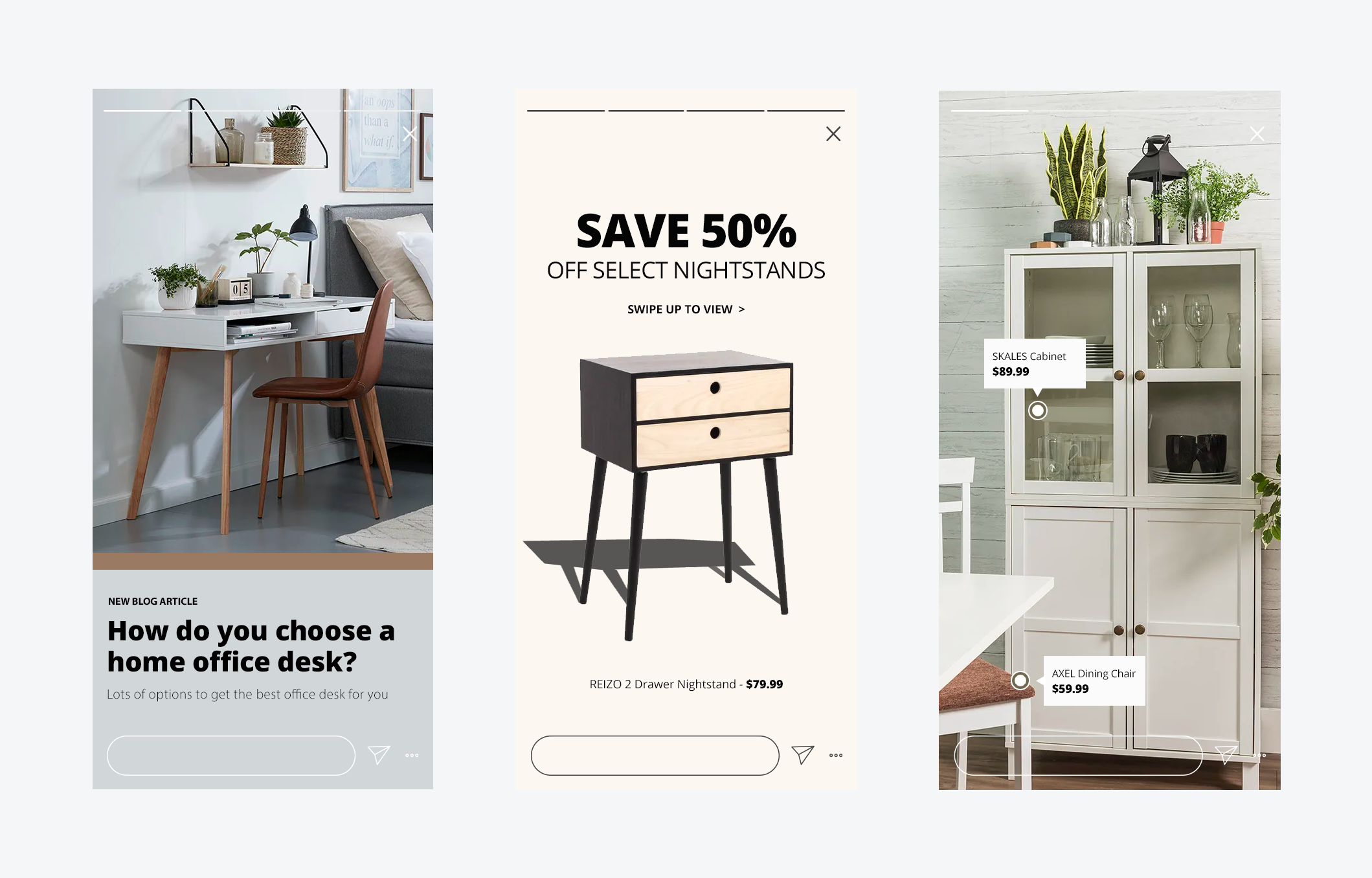
( Fig. 10 ) Instagram Stories
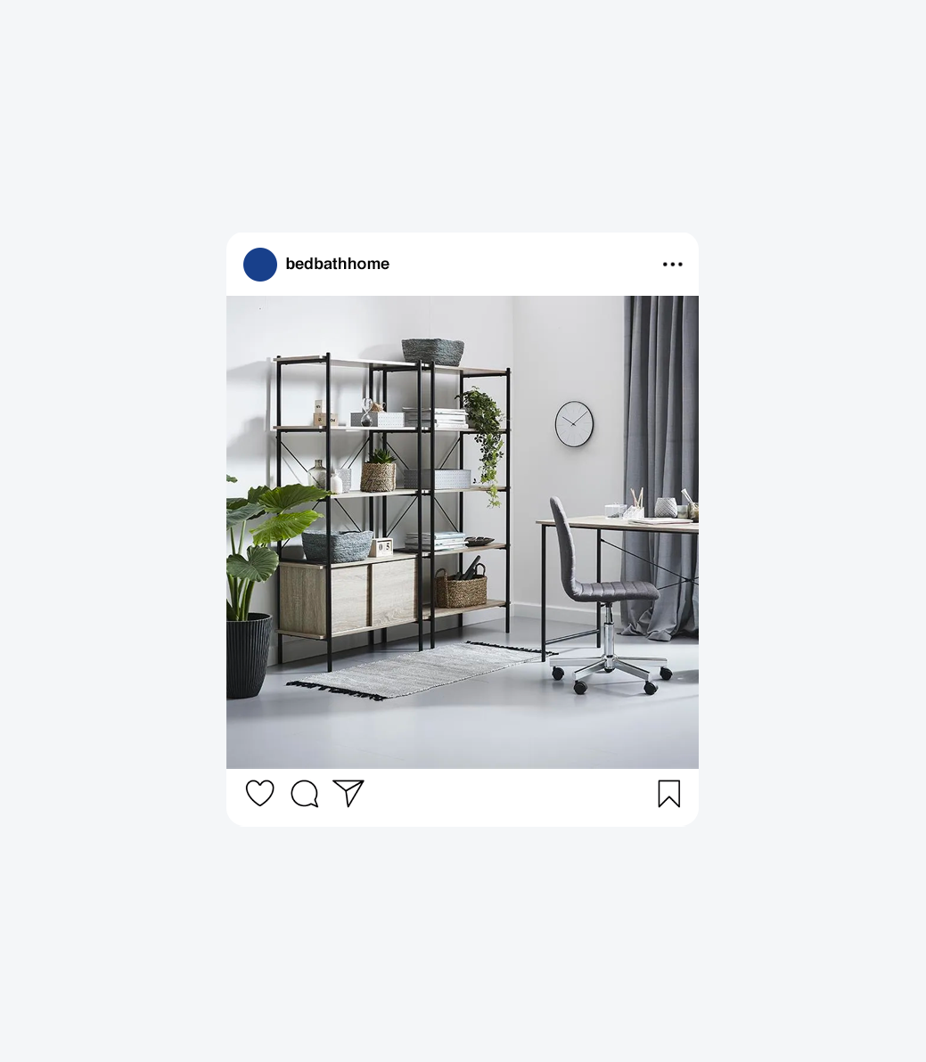
( Fig. 11 ) Instagram Post
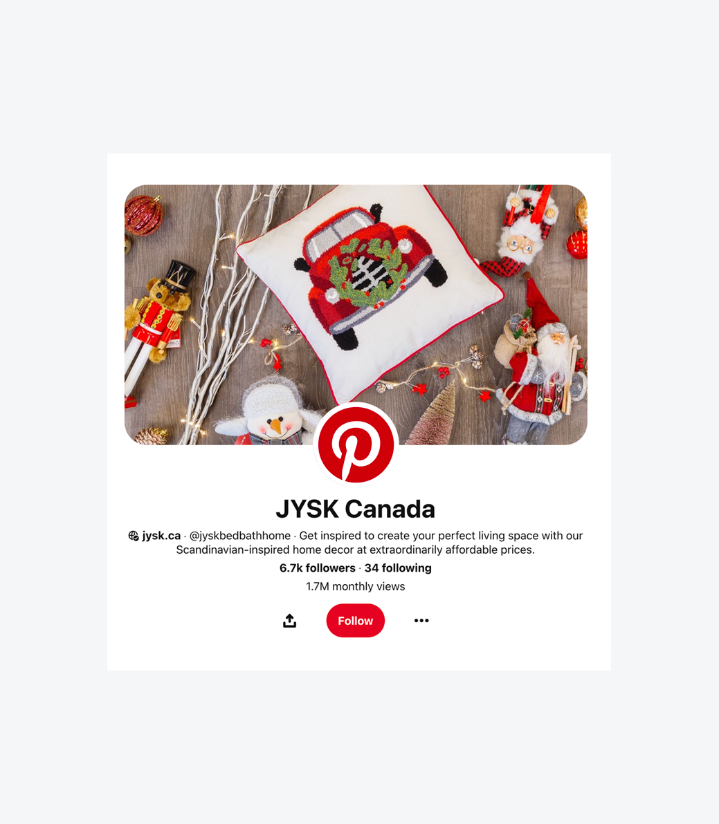
( Fig. 12 ) Pinterest Profile
Email Design
Driving traffic and increasing sales was the main focus of our email marketing efforts. Weekly deals were the main focus. Customer experience was enhanced by creating, testing and analyzing welcome,inspirational, and product review emails.
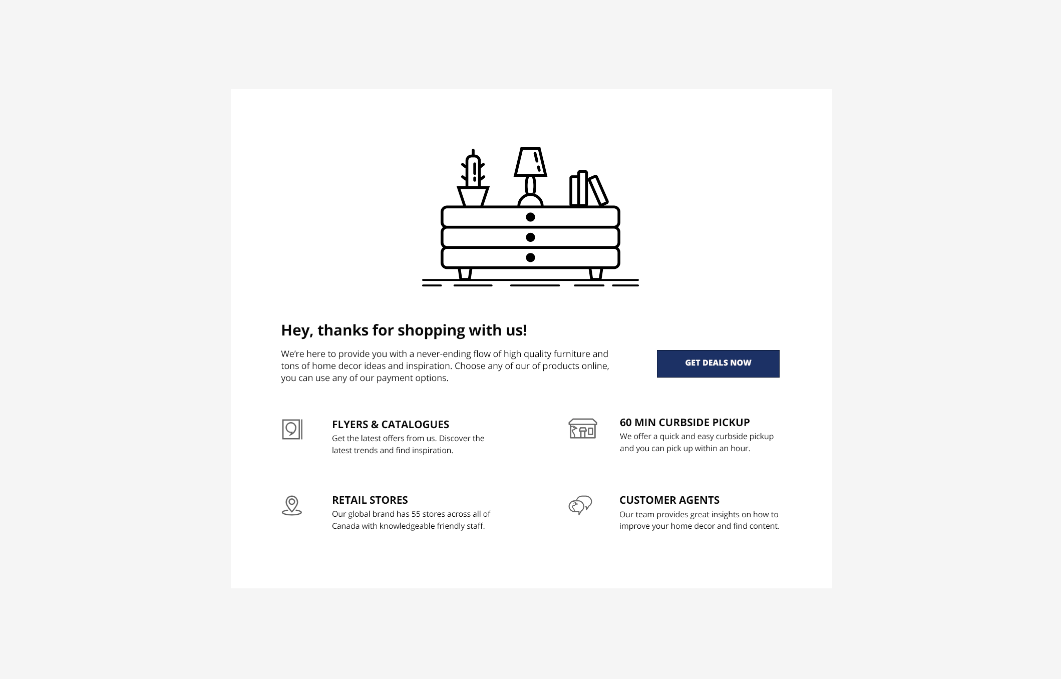
( Fig. 13 ) Welcome Email
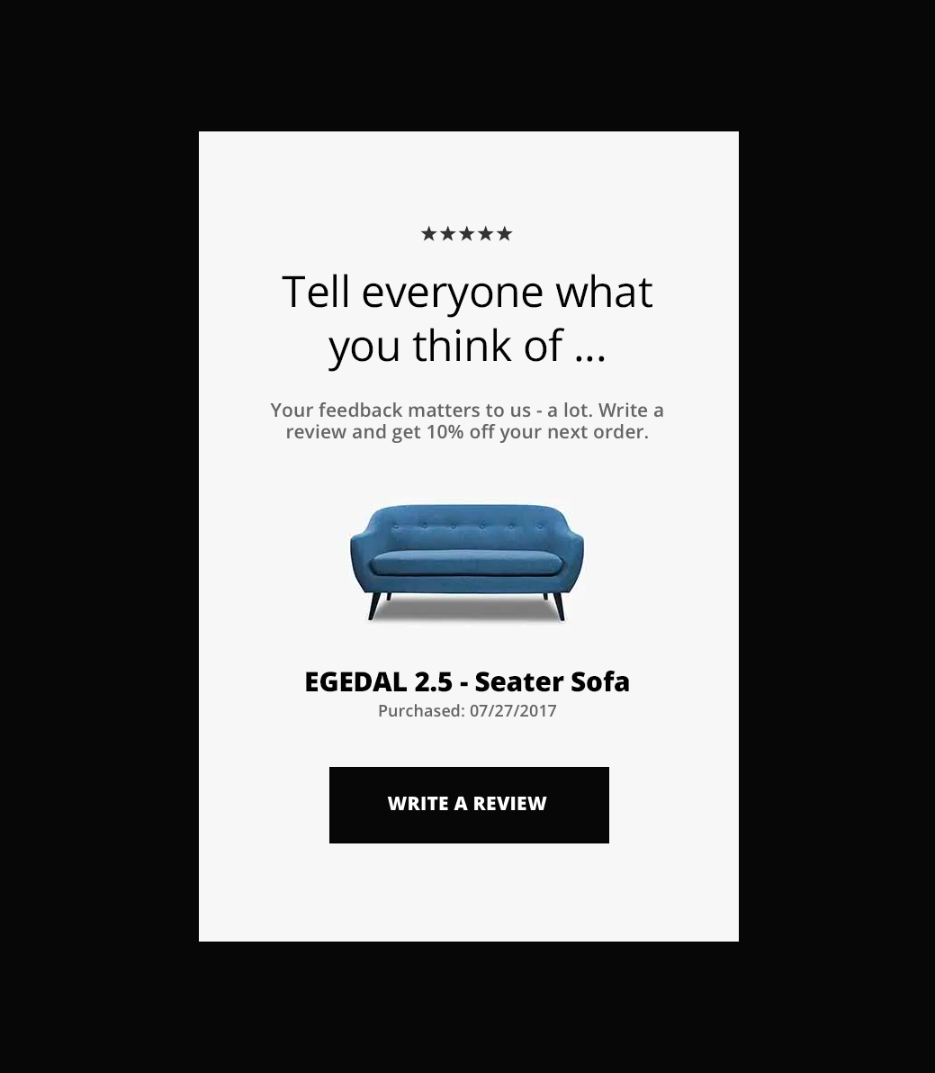
( Fig. 14 ) Product Review
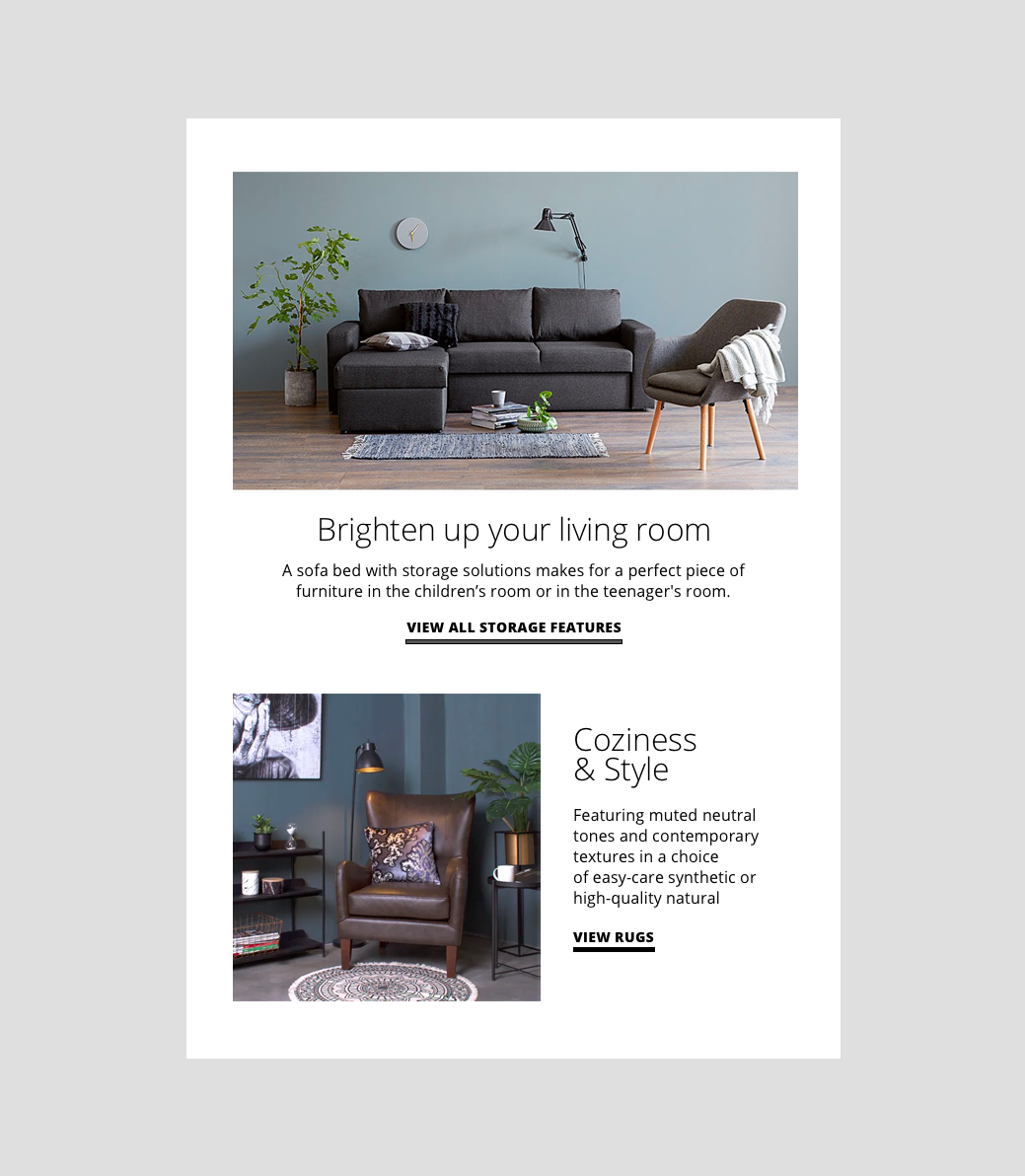
( Fig. 15 ) Inspirational Email
Category Focused
Instead of just promoting individual products the focus shifted to category. An increase in engagement was seen when emails and web graphics highlighted furniture, outdoor living or home decor instead of just a single product. Clicks were also analyzed to see which categories customers were most interested in and future campaigns were then created accordingly.
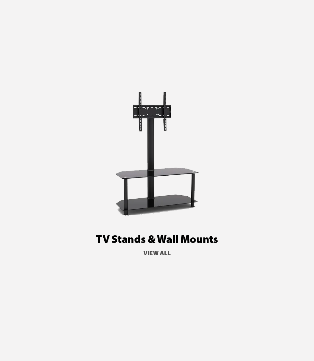
( Fig. 16 ) Product Image
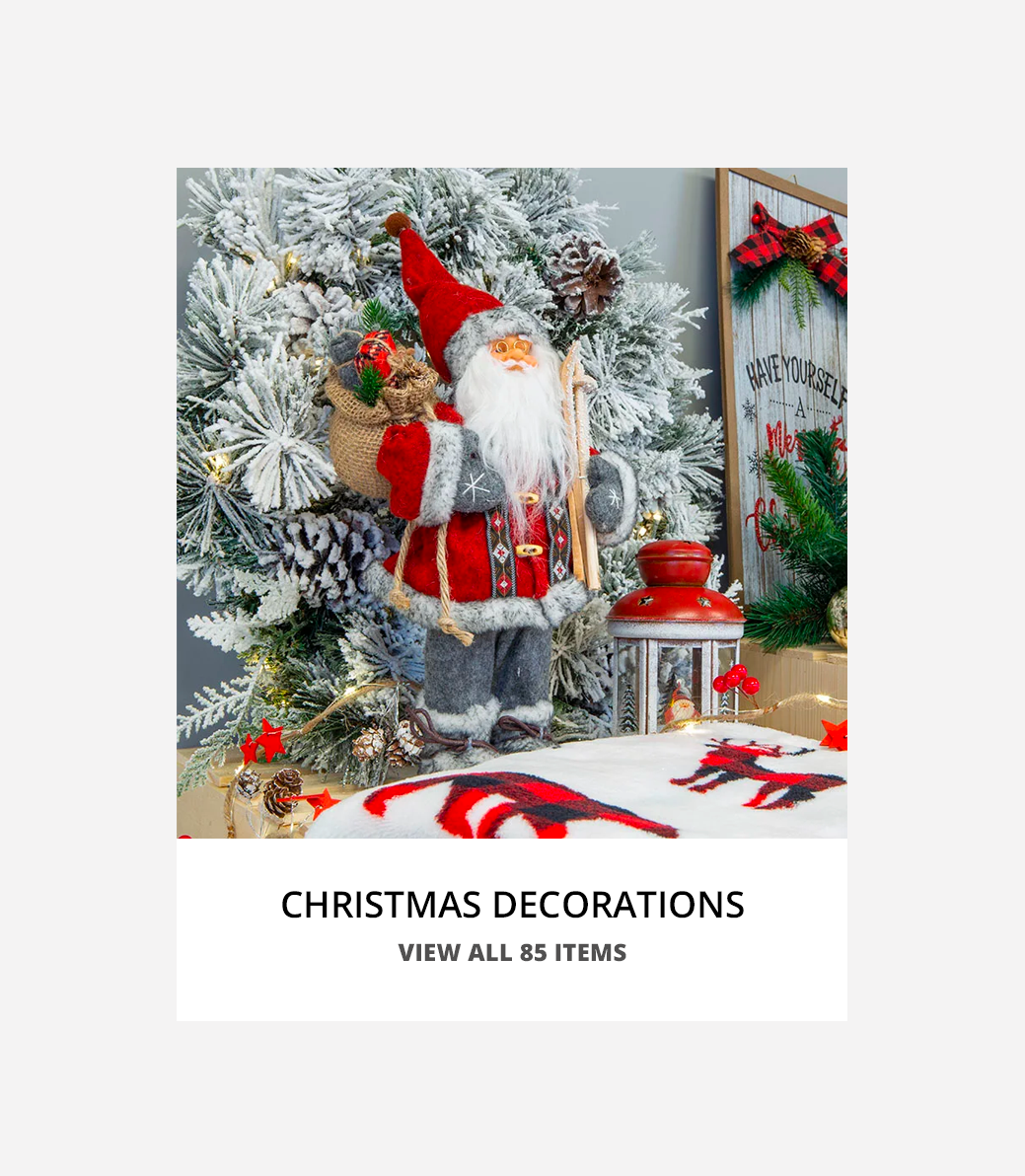
( Fig. 18 ) Number of Items
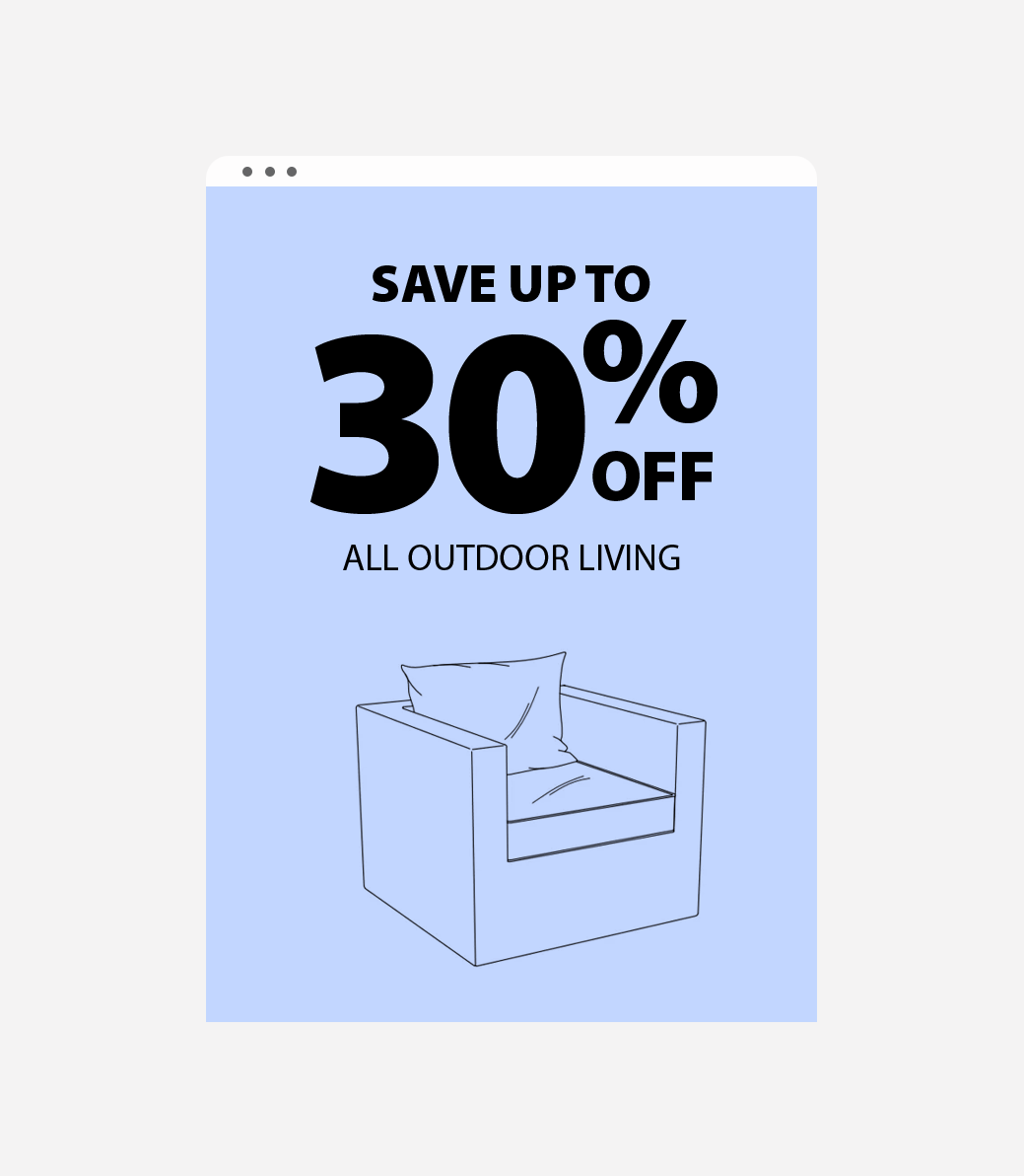
( Fig. 17 ) Product Illustration
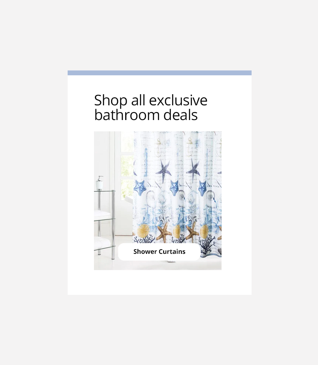
( Fig. 19 ) Exclusive Deals
Personalization & Signups
An important key performance indicator was increasing newsletter subscribers. Throughout the year sales discount incentives were used to drive up the number of customers receiving our email communications. We also rethought the preferences so we could determine which emails our users wanted to receive.
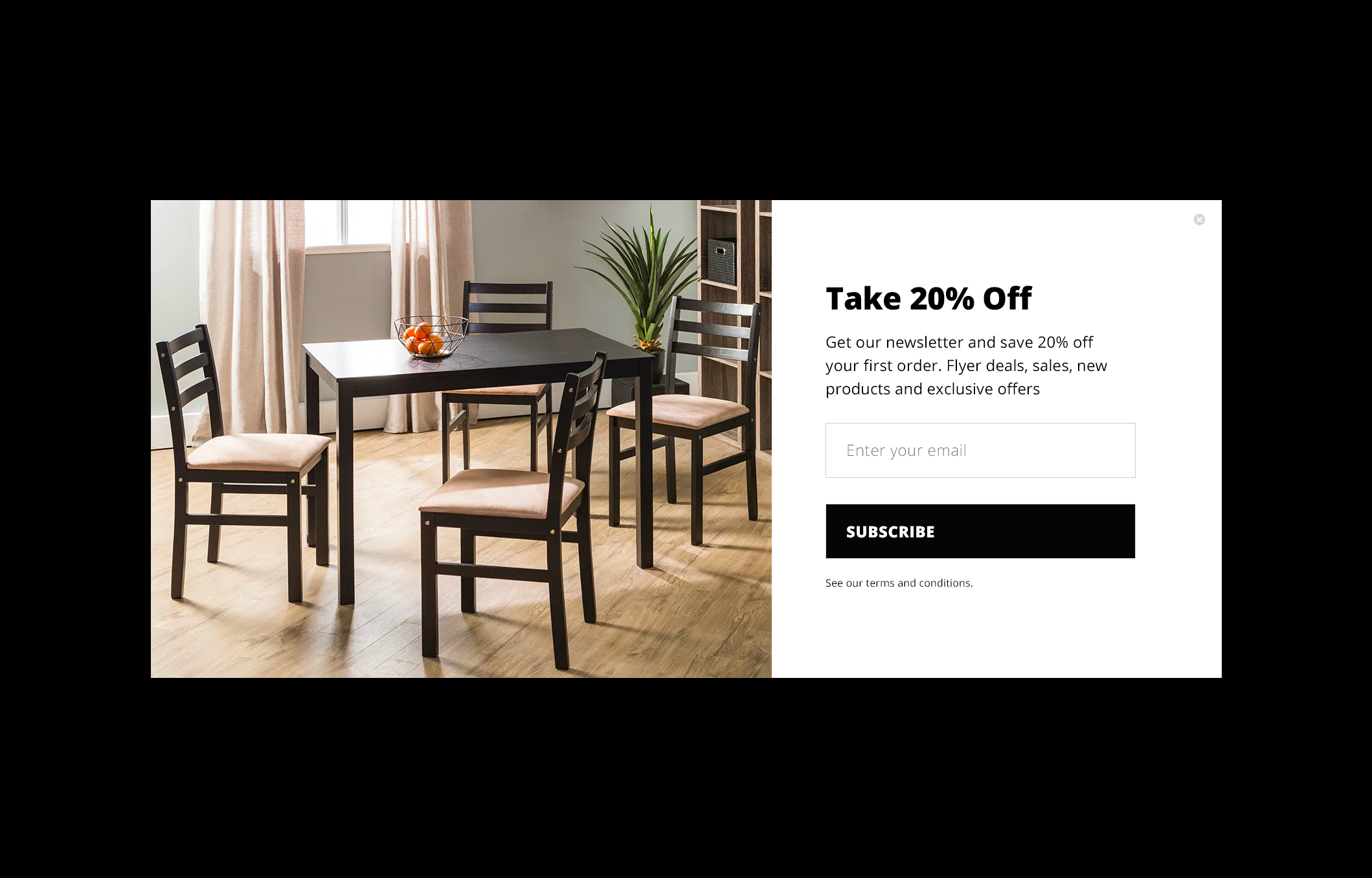
( Fig. 20 ) Email Pop-Up
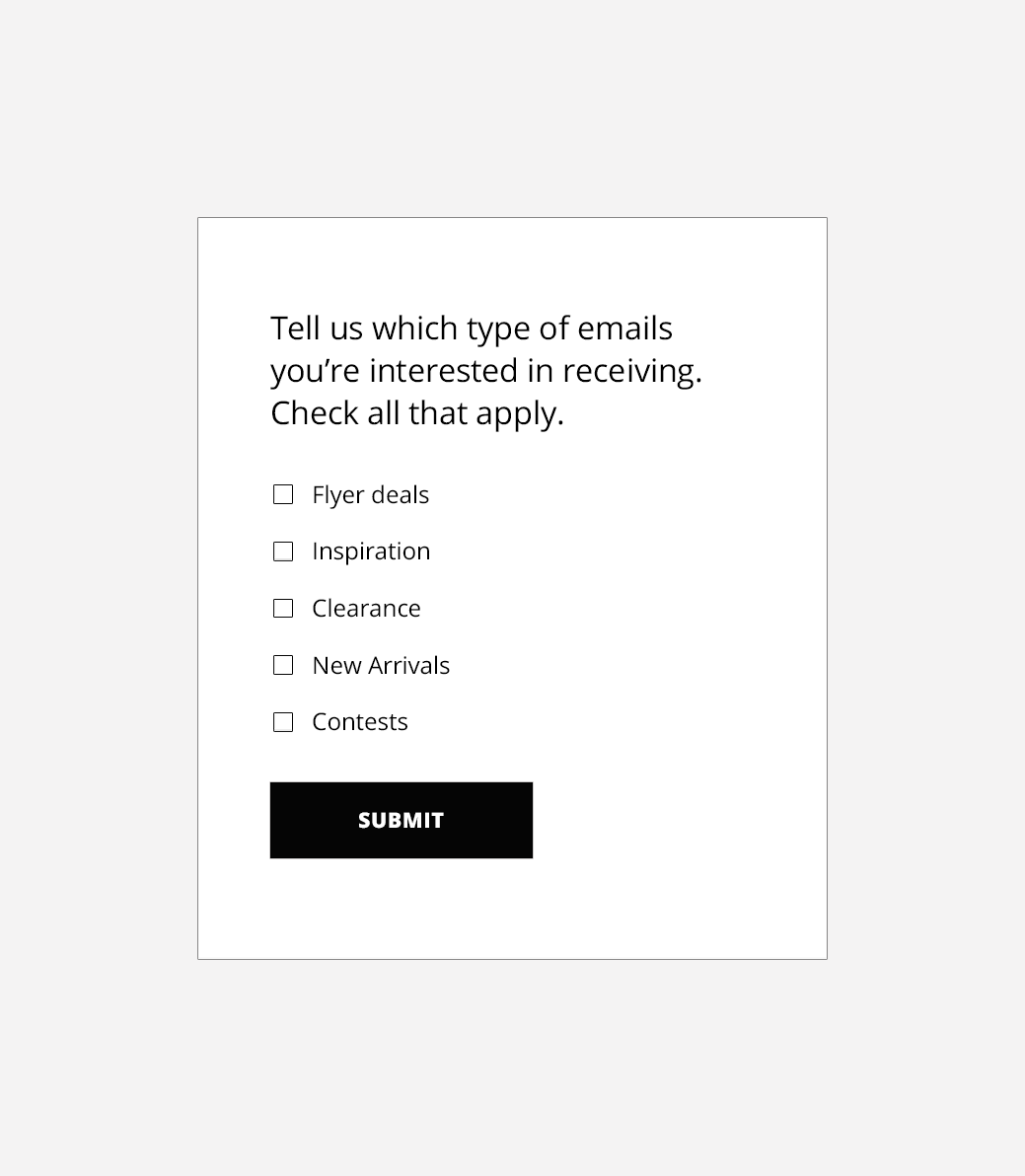
( Fig. 21 ) Preference Center
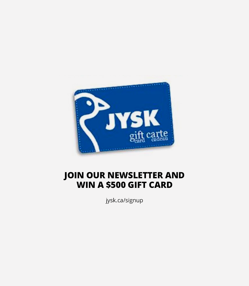
( Fig. 22 ) Incentive
Improving Checkout
Decreasing the amount of customers that abandoned their cart was another KPI. Sending out order summaries to those that purchased and encouraging those to complete their transactions were a main focus. The goal was alway to find ways to improve the overall shopping experience.
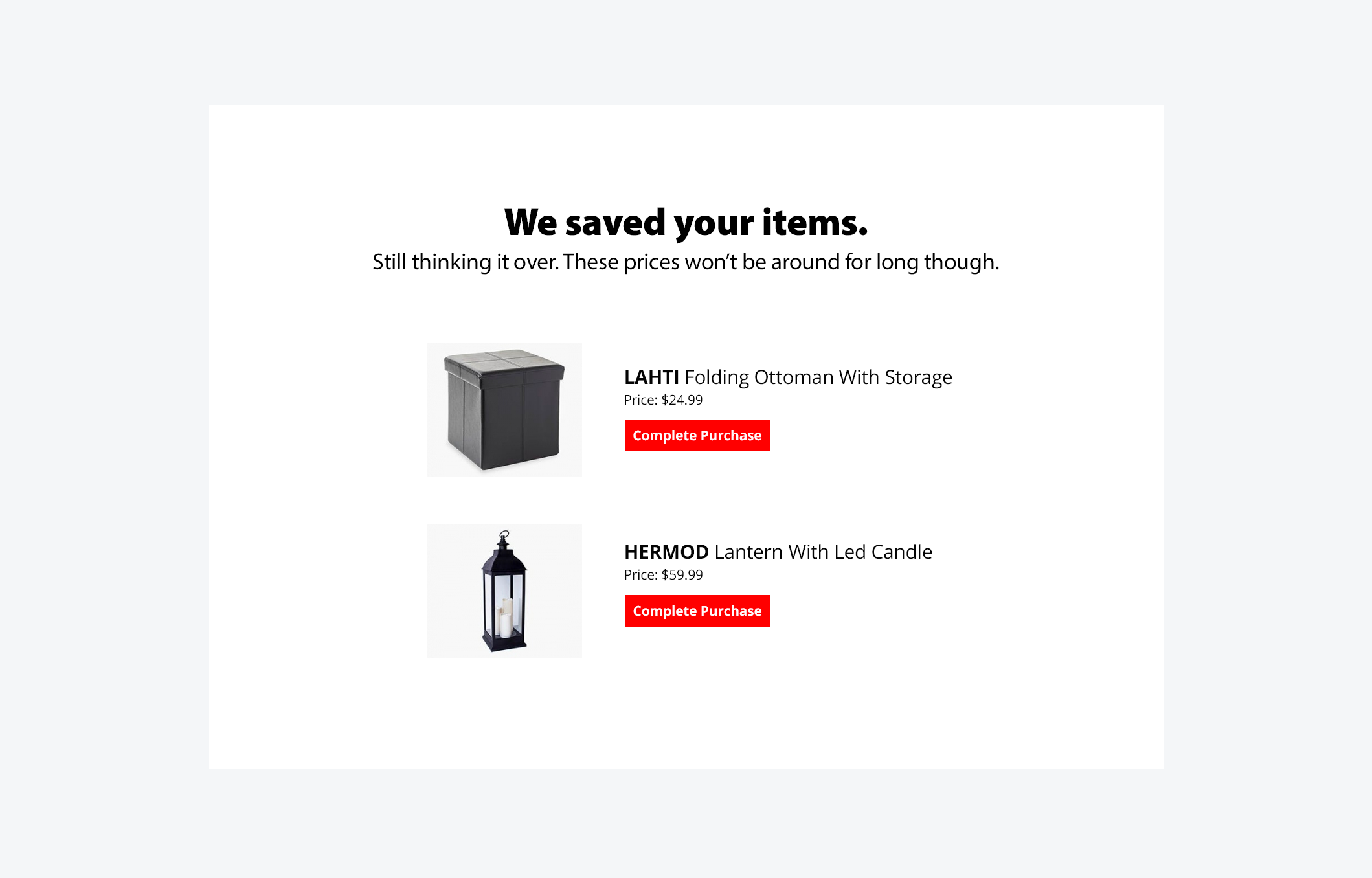
( Fig. 23 ) Abandoned Cart
( Fig. 24 ) Icon Concept
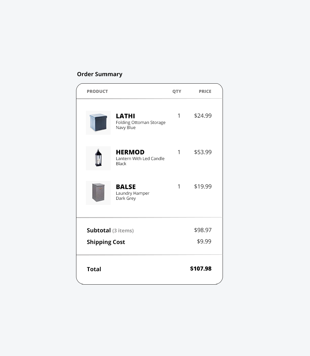
( Fig. 25 ) Order Summary
Highlights
Our e-commerce team had the most Black Friday sales in company history. I also personally take pride in improving our working relations with the merchandise buying team by including them in our weekly content calendar meetings.
I learned a lot about social media marketing, branding guidelines, online buying behavior and the value of conducting ongoing A/B testing as well as making data based decisions.
14%
Improved homepage banner clicks
$$$$
Most Black Friday Sales Ever
3x
Sales increase with mobile templates
7.2%
Increased email signups

THANK YOU FOR SCROLLING
